Designing for Touchscreens and Dynamic Orientations
What you'll learn
 Intuitive Touch ControlsMinimalist HUD DesignAdaptable Menu NavigationResponsive Orientation Layouts
Unlike traditional console or PC gaming, mobile platforms present unique challenges: smaller screens, touch-only input, and variable device orientations. For game designers and developers, mastering these nuances is crucial for creating engaging, accessible, and ultimately successful mobile titles. This article explores essential principles for crafting intuitive menus and heads-up displays (HUDs) specifically tailored for the mobile gaming experience.
The Touchscreen Imperative: Intuitive Controls
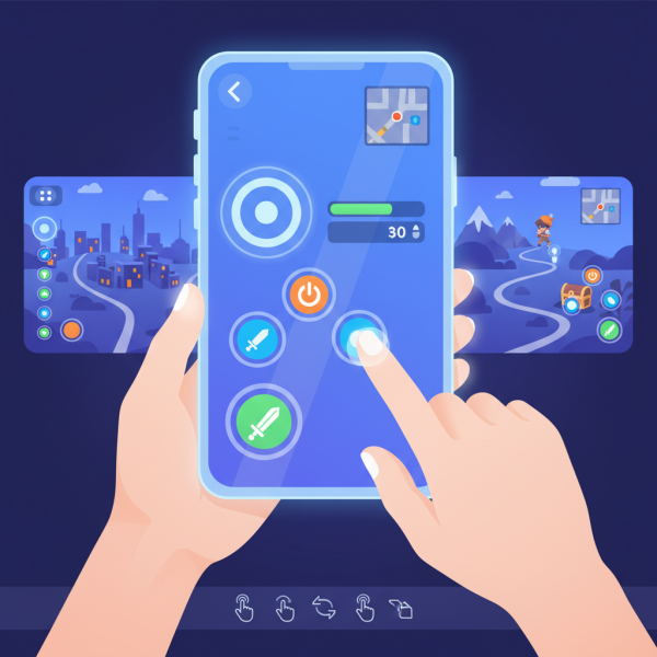
Touch input is foundational. Designers must account for the "fat finger" problem, ensuring touch targets are generously sized and spaced. A minimum recommended target size is often 48x48 device-independent pixels (DIPs), with adequate padding. Beyond simple taps, mobile games frequently leverage gestures. These should feel natural and be consistently applied throughout the game. Overly complex or non-standard gestures can lead to frustration. Consider one-handed play. Many mobile gamers play on the go, making thumb-reachable zones vital for primary interactions. Positioning critical buttons within easy thumb access significantly enhances usability.
- Tap: For selection, activation.
- Swipe: For navigation, character movement, quick actions.
- Pinch-to-Zoom: For camera control, map manipulation.
- Long Press: For contextual actions, detailed information.
- Drag: For item placement, target acquisition.
HUD Harmony: Information at a Glance
A mobile HUD must be minimalistic and prioritize essential information. Screen real estate is precious. Avoid cluttering the display with non-critical elements that distract from gameplay. Dynamic HUDs are often superior. Information can appear contextually when needed (e.g., ammo count only when firing, health bar only when damaged) and fade away when not, maintaining a clean interface. Critical information, such as health, energy, or primary objectives, should be instantly recognizable and placed consistently. Icons should be universally understood or clearly explained through onboarding. Text size and font choice are crucial for readability, especially on smaller screens or in varying light conditions. Contrast is key.
Menu Mastery: Navigating Small Spaces
Mobile menus require careful organization to prevent overwhelming the user. Nested menus can be effective but should not go too deep. Flat hierarchies with clear labels are generally preferred. Tabbed interfaces or slide-out navigation drawers (hamburgers) are common patterns for organizing multiple sections within a menu. Ensure the current section is always highlighted. Contextual menus, appearing only when relevant, can streamline interactions. For instance, tapping an item in an inventory could bring up "Use," "Equip," or "Discard" options. Accessibility features like larger text options or color-blind modes should be considered early in the design process to cater to a broader audience.
Orientation Agility: Adapting to Rotation
Mobile devices can be held in portrait or landscape mode, and a robust UI/UX design must gracefully adapt. Decide early if your game will support both or be locked to one. If both, the design must be fully responsive. Responsive layouts involve designing elements that can scale, reposition, or even change their visibility based on the available screen dimensions and aspect ratio. This is not merely stretching elements; it often means a fundamental re-arrangement. Ensure critical interactive elements remain accessible and comfortable to use in both orientations. Test rigorously on various device sizes and aspect ratios.
- Dynamic Scaling: UI elements should resize proportionally without distortion.
- Relayout Logic: Buttons and information panels may need to shift positions entirely.
- Aspect Ratio Handling: Design for common aspect ratios (e.g., 16:9, 18:9, 4:3) and how elements behave in each.
- Content Prioritization: What is most important in landscape might be less so in portrait, and vice-versa.
- Testing: Crucial across different devices and orientations to catch layout breaks.
Feedback and Responsiveness
Users expect immediate feedback for their actions. Visual cues (e.g., button press animations, item highlights), auditory cues (sound effects), and haptic feedback (vibrations) confirm input and enhance immersion. Smooth transitions between screens and UI states contribute to a premium feel. Avoid jarring cuts or unresponsive interfaces, which can imply a lack of polish. Latency in UI response can severely impact gameplay and user satisfaction. Optimize code to ensure UI interactions are snappy and immediate.
Summary
Crafting compelling mobile game UI/UX demands a deep understanding of touch input, screen constraints, and user behavior. By prioritizing intuitive controls, designing minimalist yet informative HUDs, mastering adaptable menu navigation, embracing orientation agility, and providing rich feedback, developers can create truly engaging and accessible experiences that resonate with a global audience of mobile gamers. These principles are not just about aesthetics; they are fundamental to game usability and long-term player retention.
Comprehension questions
 Why are dynamic HUDs often preferred over static ones in mobile games, and what information should always be prioritized?What are two common patterns for organizing multiple sections within mobile game menus to prevent user overwhelm?What key design considerations are essential when designing for mobile games that support both portrait and landscape orientations?